
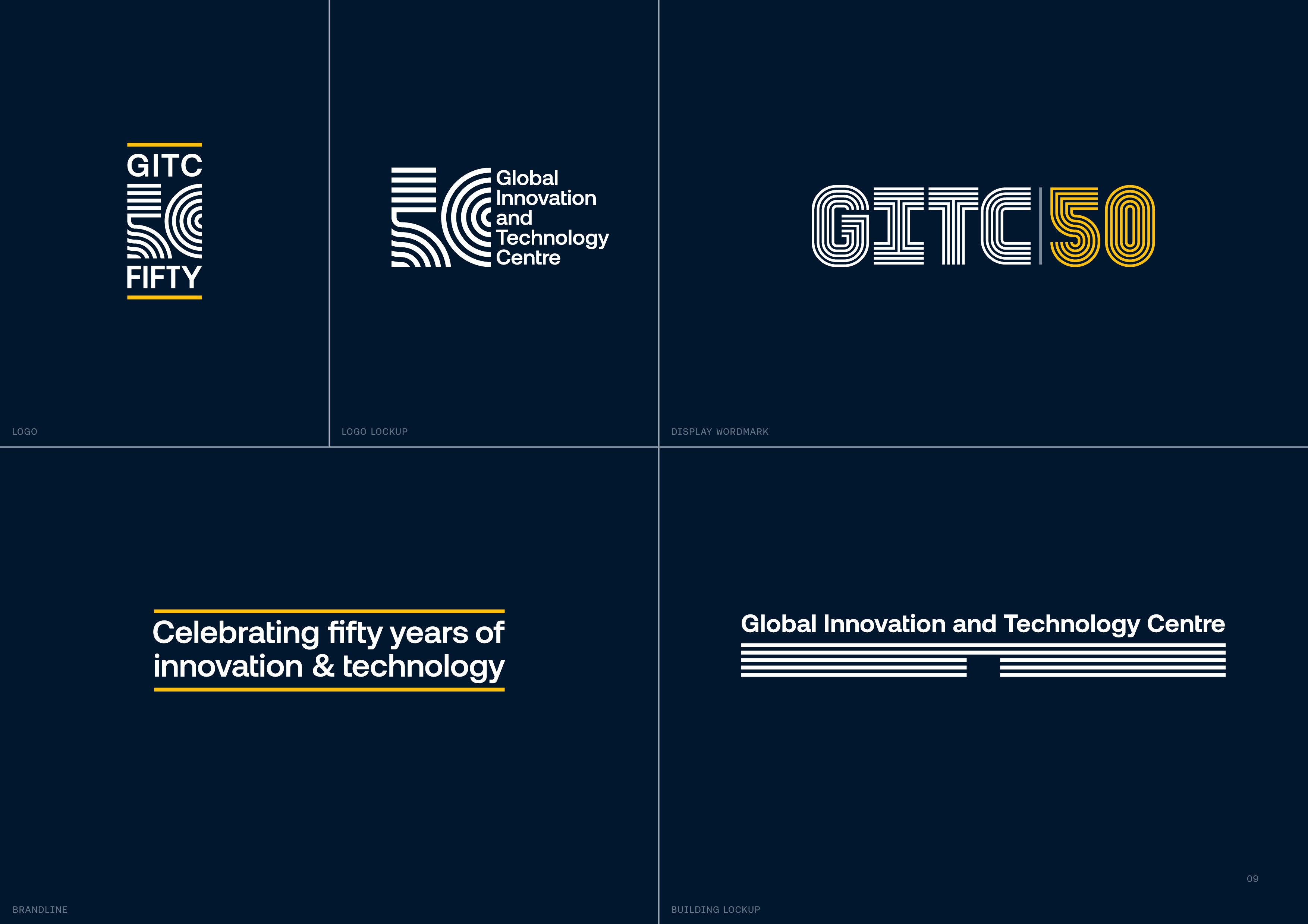
GITC 50 Identity
PA Consulting
To mark the 50th anniversary of PA Consulting’s Global Innovation and Technology Centre (GITC) in Cambridge, Design Studio at PA created an identity rooted in the architecture, history and purpose of the site itself. Since 1976, the Rogers & Piano-designed building has been the physical home of PA’s ingenuity, bringing together more than 200 scientists, engineers, technologists and designers and enabling more than 40,000 inventions across industry, government and defence.
Rather than designing a celebratory mark in isolation, the studio developed a flexible identity system capable of powering a year-long programme of events, content, client engagement and internal storytelling. The creative idea came from GITC’s iconic long, linear front elevation, reimagined as five continuous horizontal lines representing five decades of innovation. A precise central break forms the entrance, turning the mark into both a recognisable illustration of the building and a symbolic invitation into its history and future.
The five-line structure informed a bespoke display typeface and a wider visual system spanning environmental graphics, events, social content, video, presentations, merchandise and client-facing assets. PA’s ‘Apricot-03’ was used as a sophisticated stand-in for gold, signalling celebration while remaining true to the parent brand.
The identity became the visual anchor for the entire GITC50 programme and delivered measurable impact: +40% GITC webpage views year on year, +98% LinkedIn organic traffic, 8.4x video views versus PA average, and 230 clients engaged at the Client Summer Event, alongside 156 tours delivered in H1. It united heritage, pride and business development under one ownable idea.