
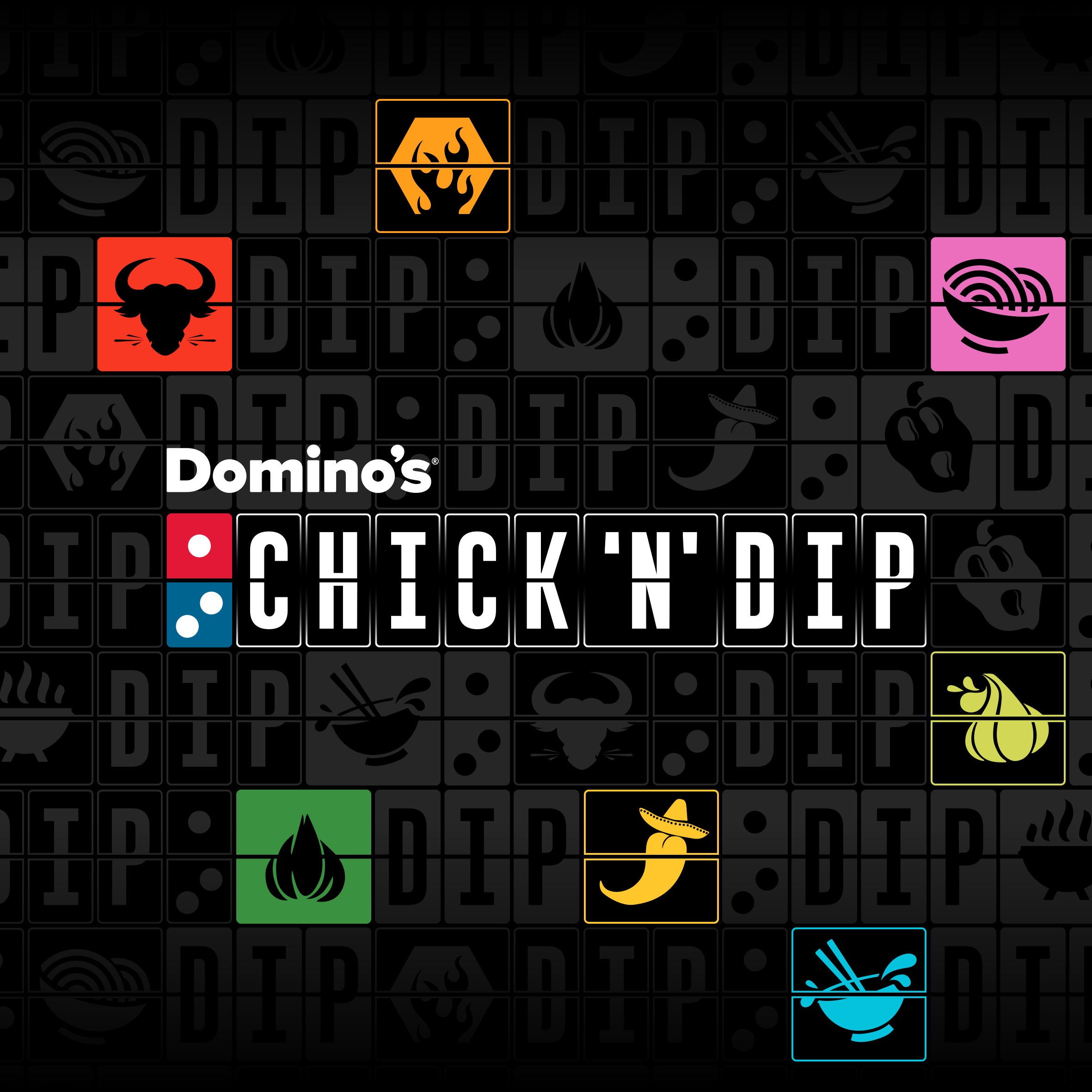
Big Dip Studio - Domino's CHICK 'N' DIP sub-brand design
Big Dip Studio, Domino's UK/ROI
Domino's was launching a chicken sub-brand. Not a new range, not a menu extension; a credible challenger with its own identity, able to stand beside the biggest names in chicken…whilst still being unmistakably Domino’s.
Big Dip Studio, Domino's 10-person in-house creative team, led every element of the design.
The proposition was simple: succulent chicken with nine dips inspired by flavours from around the world. So, we developed and delivered a brand that could take the nation’s tastebuds on tour.
The design is more than just engaging and ownable, it makes our travel obsession literal: a classic airport destination board fused with Domino's iconic tile to create a bespoke 'splitflap' alphabet. Every letter is half Domino's, half departure board. The brand’s DNA is etched into its letterform.
From there, we built two typefaces with support from our friends '&Wonder', a brand pattern, a palette generated by the dips themselves, a photographic language of colourful dunk and interaction shots, which could all scale from 40g dip lids to a 48-sheet. We even documented it all in a 75-page brand book and a pre-approved asset library serving 1,400 franchise stores.
Our fully integrated launch campaign, ‘Dip Into A World Of Flavour’ included TVC, print, digital, in-store, CRM, PR, Domino's first-ever anamorphic 3D OOH across multiple UK sites and more; all of which has delivered a whopping 21% brand awareness in just one month. All from a standing start.
A sub-brand designed in-house with commitment, consistency and craft to take on the chicken establishment.